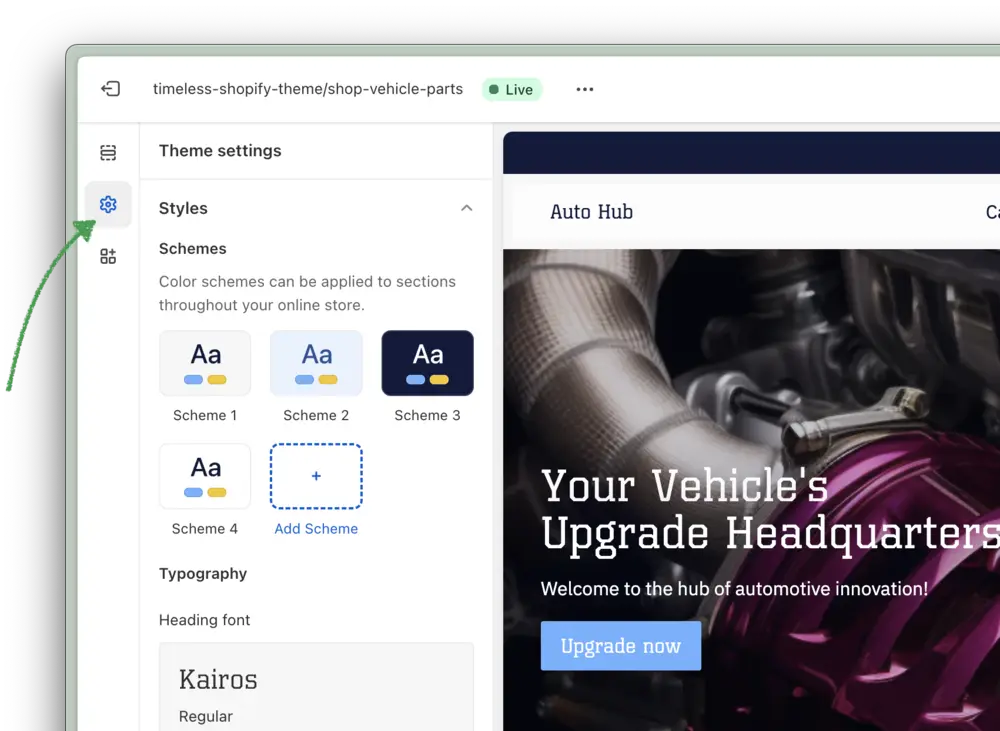
Global Styles
📂 config/settings_schema.json
The Timeless theme includes global theming options. These options are available in the Theme Editor under Theme Settings > Styles.

Theme Editor > Theme Settings > Styles
Color Schemes
You’ll find yourself setting text and background colors in multiple sections across your store. To make this easier, Timeless utilizes colors schemes. Most sections have the option to choose from a list of color schemes you define in the theme settings.
It is possible to use brand colors in your color schemes, which can be configured under Store Settings > Brand > Colors in your Shopify Admin.
Timeless’s color scheme properties include:
| Name | Usage |
|---|---|
canvas | background color |
ink | text color |
stroke | border color |
canvas-subdued | subdued state background color |
ink-subdued | subdued state text color |
primary | primary accent color |
primary-contrasting | primary accent text color |
secondary | secondary accent color |
secondary-contrasting | secondary accent text color |
⚙️ Schema Settings
| Setting | Type | Values | Info | Default value |
|---|---|---|---|---|
| Color scheme group | color_scheme_group | | ||
| Typography | ||||
| Heading font | font_picker | serif | ||
| Body font | font_picker | sans-serif | ||
| Components | ||||
| Animated emoji on hover | text | Emoji to show when hovering over action buttons. Single emoji recommended. Leave blank to disable. | 👍 | |
| Border radius | range | 0 ≤ n ≤ 8 | | |
| Fully rounded buttons | checkbox | | ||
| Date format | text | Documentation found here | %b %d, %Y | |
| Other | ||||
| Favicon | image_picker | | ||